As smartphones began to appear in increasing numbers, many webmasters suddenly found themselves with an otherwise fantastic website that some users couldn’t easily use. Mobile users didn’t appreciate being forced to scroll continuously in order to read a page or view an image in tiny morsels.
As more and more of their market shifted to mobile devices, many of them built a second version of their site – specifically tailored to the 480 x 800 format of the most common smartphones at the time.

Then, new devices started appearing – netbooks, tablets, 320px iPhones. Those webmasters were then faced with the unattractive task of building still more copies of their website, and offering users the option of selecting a version, according to the device they were on.
Obviously, this was neither cost-effective nor easy to accomplish, without causing other problems. By necessity, many businesses opted to ignore the less prevalent mobile devices, building redundant sites only for the very common models.
A Solution
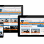
In mid 2010, Ethan Marcotte outlined a process called Responsive Web Design, which revolutionized this aspect of internet access – by all devices. His solution was relatively simple – just ask the device what version it prefers, and adapt the display accordingly.
Eliminating the need for multiple sites was enough to get the attention of a lot of people – especially when the burgeoning number of mobile users was pointed out to them. The tremendous growth of the mobile shopping market is something no business can afford to ignore.
Responsive web design, or RWD, has also been instrumental in facilitating the process for businesses that couldn’t previously justify the cost of multiple websites.
Additionally, because of the method Marcotte described, webmasters no longer needed to limit which devices they could accommodate. One website, properly structured, could be served to either a desktop or any mobile device in a layout specifically designed for that device.
How it’s Done
The process is fairly straightforward. Using media queries, the site identifies the device and transmits the appropriate layout via CSS files tailored to that display viewport. Distinct CSS files are built around each viewport, and in each instance, the one needed is called for display.
The most common approach to RWD is with HTML5 + CSS3. It can also be accomplished by implementing RDFa, but for the uninitiated, the former method will present a shorter learning curve. All that’s really required is a working knowledge of HTML and CSS.
Looking under the hood, here’s a basic description of the process:[list type=”bullet3″]
- You’ll package your basic page – the content area, header and footer and the widgets – in a page-wrap container. This will be the container that each CSS3 file can modify to accommodate the specific viewport width of the device calling for the page;
- Your HTML5 elements will need to be set to block, identifying the block of elements that the CSS3 will apply to;
- Your primary CSS file will set the width and float of the elements in the block;
- You’ll have to code your media queries, and prescribe each CSS3 file that’s to be followed, per the associate display viewport being served;
- You’ll implement a fluid layout, dictating the percentage of the viewport’s maximum width that should be utilized for each element;
- You’ll do the same for images or embedded videos, setting their prescribed percentage of the viewport’s maximum width.
[/list]As new viewports arrive and become sufficiently prevalent to warrant inclusion, you’ll simply need to add another CSS3 file and media query. No other site changes will be necessary.
Unlike the early solution of building multiple websites, there are no duplicate content issues. And any updates or additions to your site will automatically play across all available viewports. From an SEO standpoint, traffic is all directed to the same given page, from any device, and most traffic tracking software will identify the device and operating system just as they do now.
The REALLY Great News
By implementing responsive web design on your site, you’re opening your business’ doors to an entirely new slice of the shopping pie. It’s estimated that by mid 2013, the number of connected smart mobile devices will hit one billion. And mobile devices are presently responsible for over 72% more click-throughs than desktops.
Surely, that’s market potential you don’t want to miss out on? Assuming you don’t, I highly recommend you read Marcotte’s paper and put HTML5 + CSS3 to work on your site today. It’s really not a complex procedure, and the benefits are many.
Image credit to Sweethatclub.org
